Ad-VIS-ture Time
Data
For this project, we used BeautifulSoup to scrape relevant data from fan-made Adventure Time episode transcripts. Because of this, data processing was a much larger portion of this project than it was for others.
Each of the transcript pages were scraped for their relevant data using the BeautifulSoup Python library. A main Python script searched the page linked above for any and all transcript links (the wiki is structured so that all transcript page URLs end in “/transcript”). After generating this list of links, each were fed into a separate script that scraped the page and appended collected data to a single TSV file. TSV was used rather than CSV to avoid the need to remove any punctuation from the raw data. The data collected included season, episode (number and title), airing date, the character speaking, and their dialog/line content. Lines of a transcript that were not dialog (action descriptions, scene changes, etc.) had their character field left blank to differentiate them. Additional secondary data generated by the script includes line numbers, scene numbers, and the characters who speak within the current scene. Scenes were parsed by identifying scene change notes within the transcript.
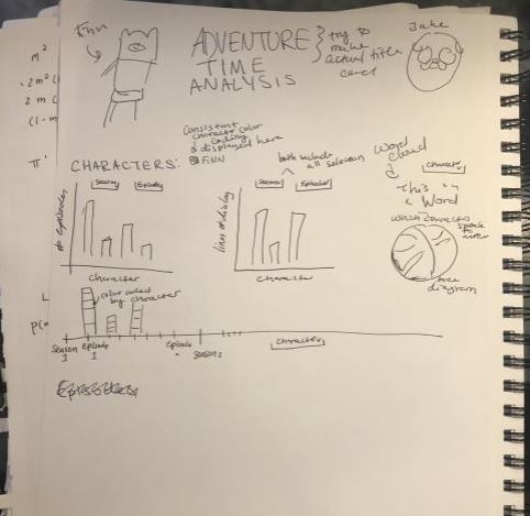
Sketches
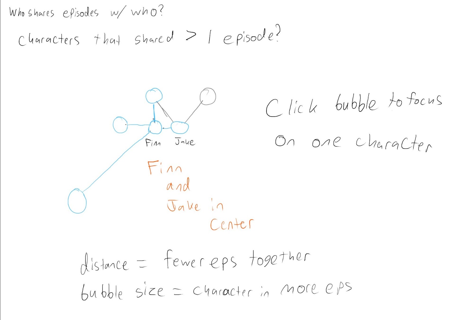
Because a lot more time on this project had to be spent on data processing, we didn't do as much sketching as we have in the past, however Veronica and I still made some basic sketches of a possible layout and some possible charts for us to present our data.
Visualizations
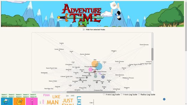
Force-Directed Graph
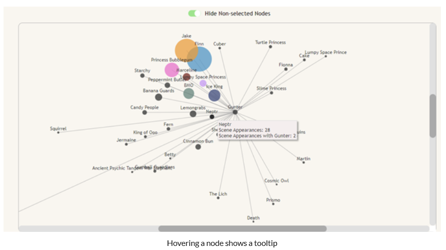
I was inspired by this visualization of how the communities of different twitch streamers overlap.
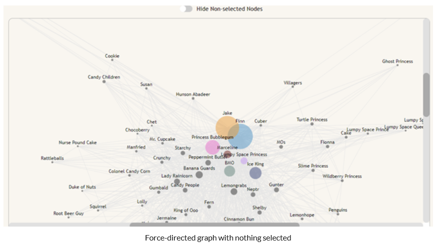
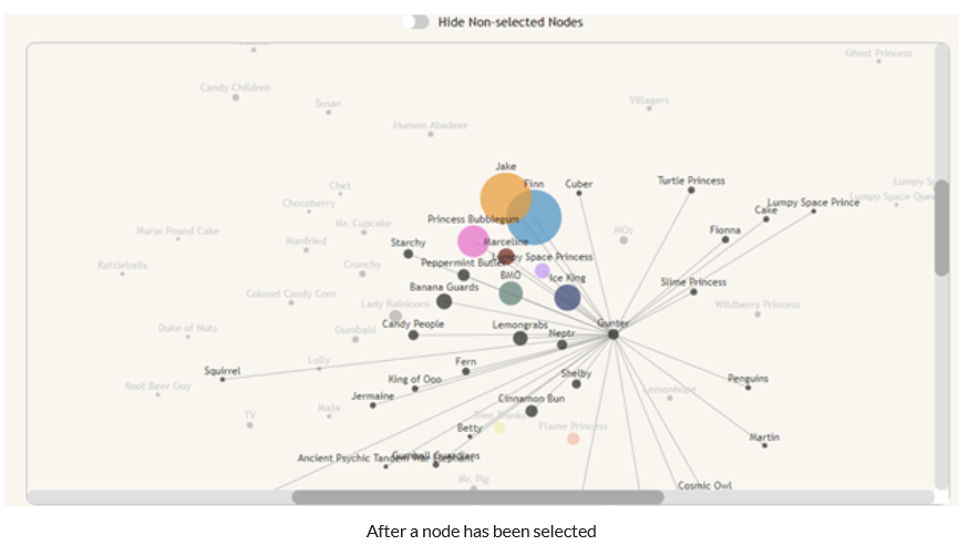
The result was a force-directed graph that shows connections between characters, the length of which was determined by the amount that they share a scene in relation to their total scene count. This prioritizes grouping characters that most often coexist, rather than just ones that share a certain number of scenes. Additionally, nodes increase in radius as they appear in more scenes, and nodes of main characters are given a color that matches the rest of the visualizations on the page. We decided to only show the top 100 characters by scene count to improve loading time, as the visualization loads slowly already.
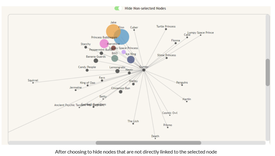
The graph includes many interactions that let the user more easily parse the info that they are shown. The first is the ability to select a node on the graph to show that node’s direct neighbors. Because the visualization is very cluttered out of the box, we decided not to put too much emphasis on the links when nothing is selected. However, when a node is selected, all of the neighbor nodes and edges of the selected node become more visible, and the non-neighbor nodes become less visible to let you focus on just the node you care about. This is most interesting with side-characters as they have fewer scenes and fewer characters that they connect to. There is also a switch that toggles whether non-neighbor nodes are shown at all, to improve the clarity of the graph when a specific character is selected.
Finally, the nodes have tooltips on them to tell the user how many scenes a character appears in. When a node is selected, the tooltip will also show how many scenes that the hovered character shares with the selected character.
Because we used a force-directed graph, the data had to be passed into the d3 component in a very specific way. We needed a node for each character that would be shown, and a link between each of those nodes and every other node that shared at least 2 scenes with each other. The first thing that was necessary was a list of each scene and each character in those scenes. Once that was collected, each character from each scene was looped through to create the nodes for the character and the links to other characters in the scene as necessary. Additionally there were several “characters” that needed to be removed because they were either multiple characters speaking at the same time or a disembodied voice whose character could not be determined. The final piece of data processing for this visualization was a large switch statement to combine characters that were called by different names. Often in the show character’s names are shortened or characters have nicknames, and this was handled within main.js.
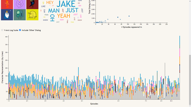
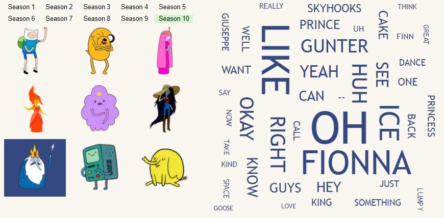
Word Cloud
The word cloud displays the most frequently said word per character. The goal of the word cloud is to view the most said words based on the selected season and character. The buttons to the left of the word cloud allow the user to select which characters and seasons they want to view. The default is set to all of the characters and all of the seasons selected. The word cloud displays 50 of the most said words divided by character. So if all ten of the main character buttons are selected the word cloud displays the top 5 words said by each character. If only one character is selected the user can view that character's 50 most said words in the selected seasons.
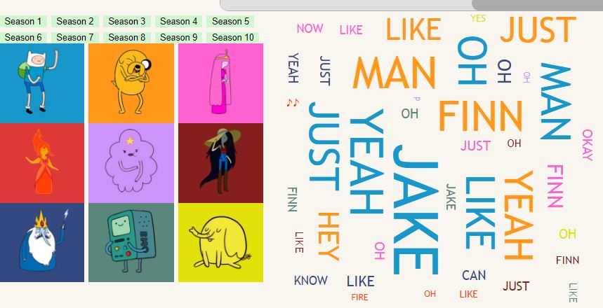
The word’s color is coded based on the character, so the character button is the same color as the words they say. The size of each word is correlated to the amount of times each word has been said. This is by the total amount of times that character said that word compared to all of the other words in the word cloud. This means that if Jake or Finn, who are the two main characters of the show, are selected, all of the other characters' words appear much smaller. The user is able to view the most said character words by season and character, allowing the user to compare what words each character’s say in each season and what they compared to each other.
Before we could use the data for the word cloud we needed to process the data in a specific way. We needed to split the words from all of the lines each character says based off of the selected seasons and characters. To do this we first needed to filter out all of the data from seasons that are not selected. Then with the data based on seasons then we have to get the words for each character. To do this we need to first check if the character speaking is a selected character. Then we need to parse the scripts. We do this by using a reg-ex to remove all of the text that is within brackets because that is action descriptions and not spoken words. I then used a filter function to remove all stop words to be able to see words more related to the content. We then select only the top words for each character. We do this by sorting the array for each character by most said words. Then returning only the top words. It does this by taking only the (number of characters / 50) words so the more characters selected the fewer words for each character but all characters are represented in the word cloud in an equal proportion.
Bar Chart
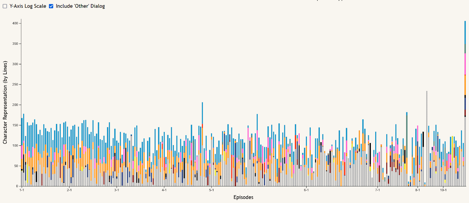
The stacked bar chart of episode dialog is meant to allow the data to be viewed in an episode-by-episode context, answering questions like “who spoke the most in this episode?” or “what seasons of the show did this character talk the most in?”. Hovering over an episode’s bar creates a tooltip showing the episode number and its total lines of dialog. The stacks of the bars are colored based on the main character button colors at the top of the visualization, and can be filtered using these buttons to remove or re-add characters shown. All characters other than the main nine are summed together as “Other” dialog, shown in gray, which can also be added or removed using the checkbox near the chart. This chart can also be filtered using the season buttons in a similar way, removing or re-adding seasons to narrow the selection of episodes shown. And to make certain comparisons easier, a checkbox is included to toggle the y-axis between the default linear scale and a logarithmic scale.
Scatter Plot
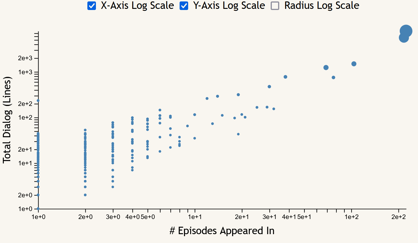
The scatter plot focuses on the frequency measures of character appearances across the entire show. Each point corresponds to a character, with the x-axis showing episode appearance count, the y-axis showing lines of dialog, and the size of each point being proportional to their total word count. Hovering over a point brings up a tooltip including the name of the character selected and their frequency data (episode, line, word, and scene counts). This chart includes toggles to switch between linear and logarithmic scales for both axes as well as the point radii.
Layout Considerations
Our initial design included a lot more basic charts to convey the information, but after we saw examples of more complicated graphs in class we decided to try them to display the relationships between characters.
We decided to add a header to the top of the page with the logo from the show with the name. The background of the header is a background from Adventure Time, and a 3D model of Finn using Zdog. We put the force directed graph large and in the center since it is the most interesting visualization visually. We chose to represent the character buttons with pictures of the characters with a colored background that denotes that character in the visualizations for a more interesting visual. We wanted all of these visualizations to be at least partially visible at the same time since the word cloud and the stacked barchart are connected.
Findings
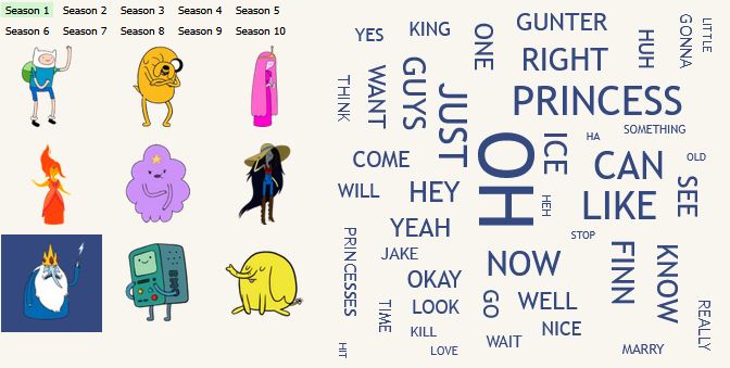
One insight that can be seen on the word cloud is that in the first season are selected one of Ice King’s most said words is princess, because at the beginning of the show Ice King often kidnaps Princess but in the final season princess is a much smaller word because as the show progresses Ice Kings character progresses to be less focused on kidnapping.
The word cloud also allows the user to view which characters have strong relationships with others based on the amount of times they say their name; this further exemplifies the visualization shown in the force directed bar graph. For example in this picture you can see that Ice King has a relationship with Gunter and most characters say Jake and Finns names the most.
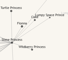
One insight that can be seen on the force-directed graph is that a lot of the princesses in the show are connected to the characters from the Ice King’s fictional stories involving common characters from the show with their genders changed. This is because in the early seasons, Finn and Jake often have to save princesses that were taken by the Ice King. In some of these episodes, he reads them his stories.
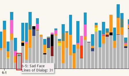
One example insight from the stacked bar chart is that there are extremely few episodes that don’t include at least some dialog from Finn and/or Jake, shown in blue and orange respectively at the top of each bar. The easiest to spot example of this is season 6 episode 5, “Sad Face”. This episode is mostly without dialog as it centers around Jake’s tail living a life of its own as a circus performer while he sleeps.
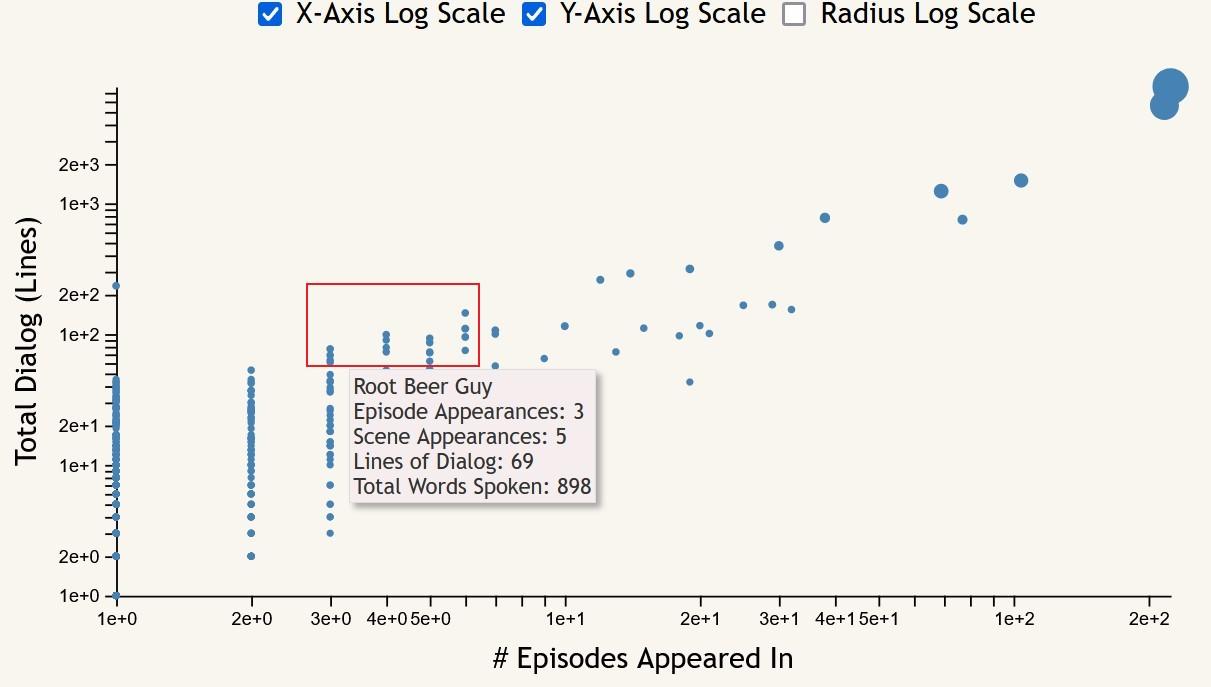
Something that the scatter plot makes easy to see is the “important side characters”; that is, characters who appeared in few episodes, but have relatively high line and word counts. These can be seen most easily with both axes set to log scale, appearing at the top of each of the lines of character points that form for each number of episode appearances.
Future Work
Overall I was super proud of how this project turned out. Adventure Time is my favorite TV show, and I had so much fun coming up with visualizations to show how the characters are connected. However, nothing is perfect and there is always something that could be improved.
Firstly I felt like the layout could have been improved if we had more time. I really like the idea of having a dashboard layout for vis projects like this because many of the graphs are related. Originally I wanted to have the force-directed graph interact with the word cloud and other visualizations. Without a dashboard layout it would be frustrating to have to scroll back and forth to control the visualizations in that way.
Additionally, the transcripts were incomplete while this project was ongoing. This is the nature of using fan-made transcripts, but if we continued work on the project it is very likely that more of the later episodes would be filled out.
Collaboration
Colin Conn
Force-Directed Graph and Sketches
Noah Shremshock
Data Collection/Formatting, Line Chart, Scatter Plot
Veronica Ufferman
Word Cloud, Filtering, 3D Model of Finn, and Sketching