Smart Toilet Refresh
Previous Work
This is a redesign of a project completed for my User Interface 1 course. The original project was my first UI project, and it was originally developed using vanilla JS, CSS, and HTML. I originally decided to redesign this project in order to learn Svelte as the course I was TAing was being switched to use Svelte. However, the redesign got put on the backburner for a while and I've finally finished it up!
For the initial project, we were tasked with completing several pre-design steps. these included feature and interface sketching, needs gathering through interviews, and creation of design assumptions and requirements. A more detailed write-up along with a demo video can be found on my old portfolio
Redesign
My main focus for redesigning this interface was to make it more usable as a touch screen and to make the interface feel more cohesive (styling unstyled inputs, using colors more intentionally, etc). I first mocked up the redesign in Figma before reimplementing it in Svelte.
Figma mockup of the main interface
Figma mockup of the phone interface
Interface Updates
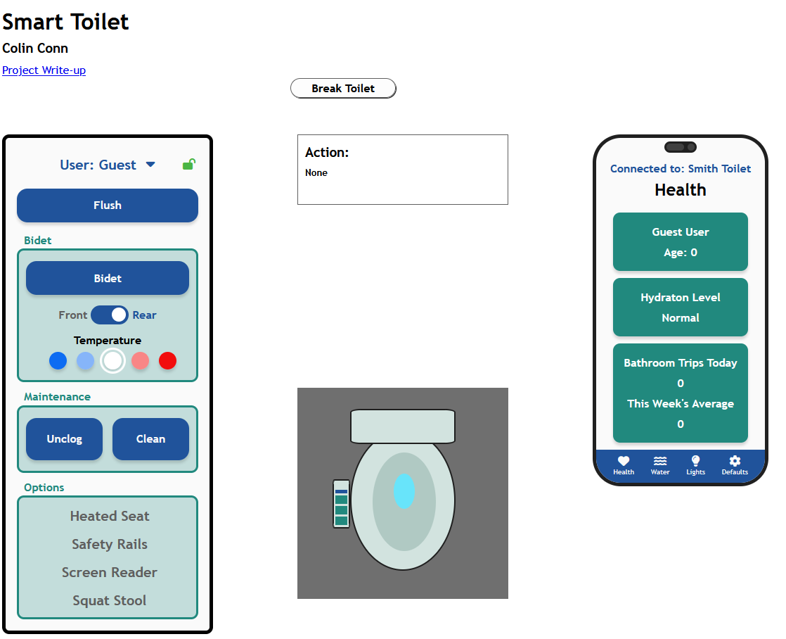
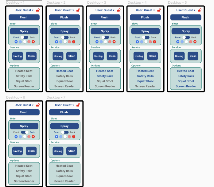
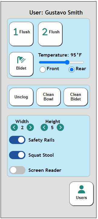
Old Interface
New Interface
A main focus of this redesign was to make the interface easier to use for a touch screen. This meant increasing button size across the board. I realized that users don't need to set an exact temperature for something like a bidet, so I changed that input to be discrete. The accessibility settings were changed to large text that is gray when the feature is off and blue when the feature is on. I removed width and height from the main interface as those would be less likely to change for the same person while they used the toilet. Additionally, I added a locking feature to prevent accidental button presses and updated the user selection to look cleaner and more clear. Finally, I added clearer labels to the input groups to make them easier to find.
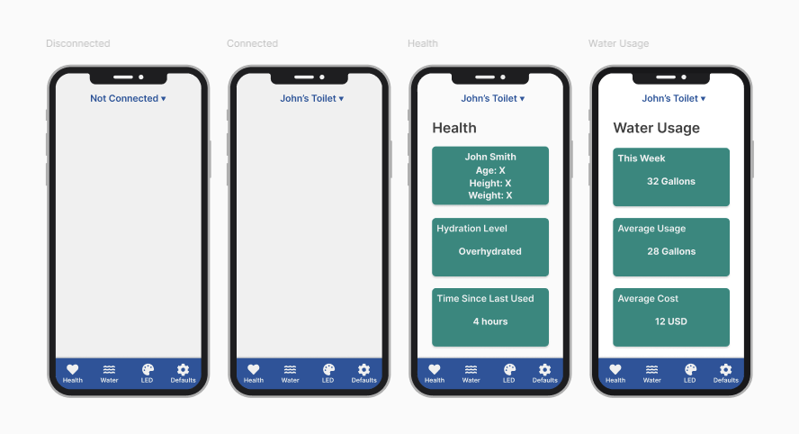
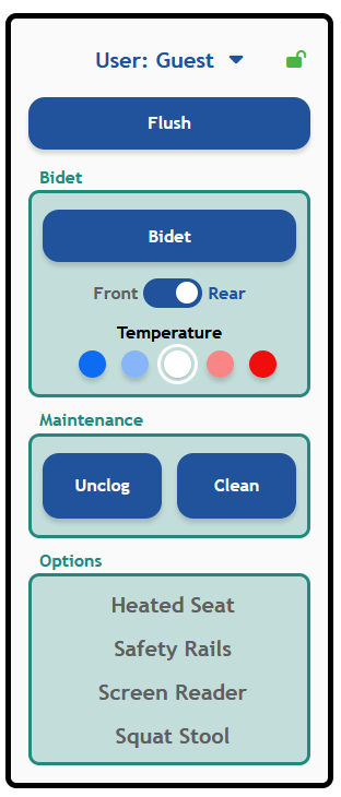
Old Phone Interface
New Phone Interface
My intentions for updating the phone interface was to improve readability and keep my color choices cohesive across the whole app. Because in the main interface blue was used for buttons, it was better to keep that color for navigation of the app and change the readable sections to use green instead. I also updated the spacing to make the sections easier to read. The final change I made was to change most of the uses of LED to say 'Lights' instead to make it more clear for older and younger users.
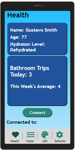
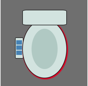
Old Graphic
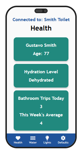
New Graphic
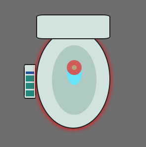
This update was more for me than anything. One of my favorite parts of the initial project was that when the user updated their LED color choice, the graphic updated as well. I decided to extend this to also include the bidet, cleaning, and unclogging actions!