
SNACE (Senior Capstone)
Motivation
Abstract
Our project aims to fill a void in collegiate Overwatch esports by providing a useful and usable tool for data visualization and analysis. This tool will be web-based and highly accessible, with a focus on user experience. Players and analysts can use graphical & spatial visualization of game data to gain insights and improve their play beyond what is possible with simple replay footage.
User Stories
- As a player, I would like to see how my positioning in-game affects how effectively I am playing.
- As a player, I would like to see how my positioning compares to that of the opposing team's players.
- As a coach, I would like to see how my team's performance is linked to their positioning on the map.
- As a coach, I would like to analyze a position on a map at a specific time.
- As a team, I would like to move through a map and see where the majority of fights took place.
- As a casual player, I would like to view the most common positioning spots for a specific role.
Data
The data for this project was collected from scrimmages played by the University of Cincinnati's Overwatch Club (UCOW) Red team. Overwatch allows its players to create custom game modes that can be played by anyone. Using that functionality we were able to create an game mode that logs player statistics for both teams. The data is collected as a text file, and we created a python script to turn that data into json that could be used by our tool.
Visualizations
Our site was created using JavaScript, CSS, and HTML without a framework, and all visualizations were created using D3.js. This was decided because both team members took a data visualization class where this was the method used for all projects.
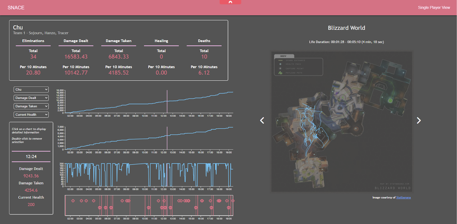
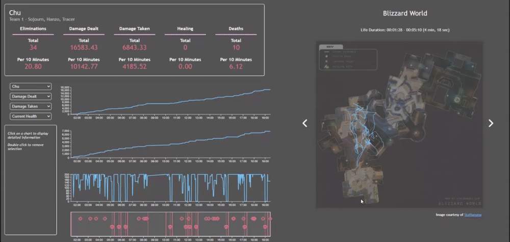
Single Value Statistics
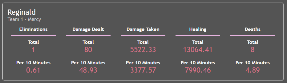
The most basic visualization that SNACE offers is the Single Value Statitics. These are values that only change based on the selected player. These values are those that are most often shown on player infographics in Overwatch, and stats are often displayed as a value per 10 minutes because of varying match times.
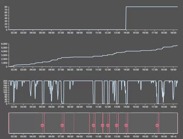
Line Charts
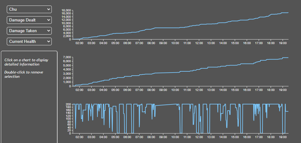
SNACE includes 3 customizable line charts for the user to view cumulative statistics for a player throughout the duration of the match. The statistic shown by each line chart can be changed with the selection boxes to the left of the charts.
Additionally, the player who's data is being shown can be changed which updates the whole page to display that player's data. Each player is assigned a color (a shade of blue for team one and orange for team two) to make the change more distinct.
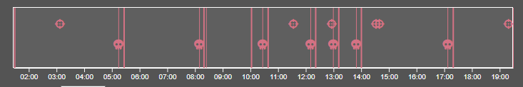
Below the line chart is a timeline to provide extra utility to the line charts. The timeline includes symbols for final blows (crosshair) and deaths (skull). The timeline also includes line markers for the start (thicker line) and the end (thinner line) of each life.
Player Travel View
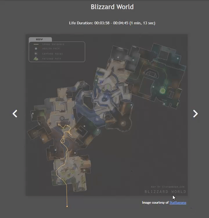
The map visualization shows a player's movements throughout each of their lives in the match. The beginning of a player's life is shown by a circle at their start position. We decided to overlay the lines on top of an image of the map that the game was played on for easier understanding of the movements.
Above the map, there is a display showing the duration of the currently displayed life. This lets players see when they are quickly losing fights, which can then be focused on in a retrospective review.
Using the arrow buttons on the sides of the map, a user can toggle through each life of the selected player. This allows them to see which pathing choices led to longer lives and more success in that particular match.
Interactions
Line Chart Hovering
The user can hover over each line chart to see the exact value of the given statistics on all three line charts at that timestamp.
Additionally, hovering over one of the line charts changes the data displayed on the map view. Instead of showing the player's path, every player in the game is marked on the map by their position. This allows the user to brush through the entire course of the match and watch the players move around the map.
Line Chart Marker
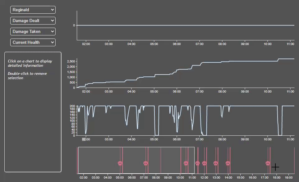
The user is also able to set a static marker at a timestamp to allow for easier comparison of different points in the match. When the marker is set, single value statistics for each chosen statistic are shown. The marker can be moved by single clicking at a different point on the chart or removed by double clicking.
Timeline Brushing
In addition to showing lifespan, the timeline can also be used to brush through the line charts. This allows users to take a more in depth look at a shorter timespan (using the life markers for example).
Challenges
When the project began, Activision Blizzard, the creators of Overwatch, were in the middle of changing the game in a big way. The game was to be taken off live servers and then reintroduced as Overwatch 2. This caused many issues for the project. First, there was a full month where the game was unavailable for us to use, which meant we couldn't make much progress. Additionally, when the game finally released, it was added without the workshop mode available. The workshop is how custom game modes are created, and for a long time we thought that we wouldn't be able to control the data that we could collect. Luckily, there was an open-source extension that let users create custom game modes in a python-like language. Using this extension we were able to change the existing game mode to collect data that was more useful for us.
Future Work
There are several features of the tool that we are looking to improve on as we continue to work on this project. First, we had some complaints from players about optimization problems with the custom game mode. If we want players to actually use our tool, this is likely our first priority. Additionally, we would like to transition to using a JavaScript framework like React. Originally we decided not to use any frameworks because we were unsure of how they interacted with D3. However, as we move to expand the tool, we realized that we needed to change to using a framework in order for us to more easily use things like routing. We would also like to utilize a database so users can upload and view several games at a time to compare their performance against multiple teams.
Outside of quality of life fixes, we also have a good idea of some possible directions for improvements. One idea that we had from the beginning of the project was to create 3D visualizations of the maps in Overwatch. We didn't end up working on it for our capstone, but it is still something we would like to implement. Overwatch is a game that favors verticality, and 3D visualizations would be able to better display statistics at different altitudes. One other iteration idea is to use data analysis tools to determine more info about the matches. For example, Overwatch matches usually consist of several whole-team interaction (often called team fights), and we could use tools to help determine the beginning and end of these interactions or annotate charts with potential insights during them.
Collaboration
Colin Conn
Map and Single Value Statistic Components and Data Collection/Handling.
Noah Shremshock
Line charts and Line Chart Interactivity